KAYE'S DESIGN
The Examination of Applying Illustration Style to Animated Commercial
Tuesday, November 8, 2011
Saturday, October 29, 2011
Friday, August 19, 2011
Final video-Brainstorming
Here is the final videos for Masters show and DJCAD.
video for DJCAD
video for Masters show
You could notice that there are several changes in the audio. Reece remix the audio to make the video harmonious.
video for DJCAD
video for Masters show
Progress
There have some changes I've made since last time I posted my video. I changed the angle of the camera in 1st shot since the front view seems like too flat. And I used a coherent shot instead of using 2 separate shots to depict the view after student's head opened.
I also changes some textures in the last video. Some textures I used are not fit the view.
Thursday, August 18, 2011
Brainstorming- Process of Production
The animated commercial 'Brainstorming' is my first motion graphic design work. I have made great progress on 3D animation learning during the study this year.
Since the whole project is also a commercial package for Duncan of Jordanstone College of Art and Design which include the Poster, invitation and the TV commercial. The requirements and suggestions of my clients are also crucial parts of my project.
My client didn't restrict the style and content of the commercial. The time should lasts approximately 1 min. And the objectives is to encourage general public, art collectors, employers to attend the show, and to make DJCAD as a creative hub in Dundee.
Although I have handed in my final video and all prints I still not satisfied with part of the video. Due to the reason that I have to finish the final video before 7th of August I can't achieve some effects.
The completion of each section.
1. Modeling 80%
2. Animation 80%
3. Compositing 100%
4. Special Effects 90%
5. Audio & Sound effects 100%
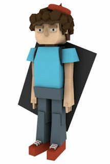
My original idea is not only modeling a character with a still pose, but also rig the character and animate it with several simple movements. However, It took me more than half month to develop the character I want to use. It exceeded the time I arranged for modeling. So I gave up the idea of making character animated. Instead, I add some facial expressions like blink and smile.
The inspiration of the character design is the video called 'Kill Your Co-Workers'.
The character in this video was made with geometric shape and textured with sketch style.
1st character I designed I found the view seems like too clean and it's difficult to animate this character with some movement, because the geometries are not enough. Besides, compare to the original video I chose which have plenty of characters, I only got one character with different props.there is another inspiration for modeling and character design is the character made by Mcbess, an illustrator and director. The characters he designed have curve figures and looks cool.
I separate my video into 5 parts:1. Character's body fill up with liquid and then his head opened.2. Some colorful object popped up from his head and the camera zoom into the 'eye'.3. The motions of the brain.4. The grid world(all objects textured with sketch tag).5. Camera zoom out from character's eye.I gave myself one week time for each part, so I could clearly know if I already behind schedule.Since I made the video with sound effector so the scene is exactly accord with the beats, It's easy to compose all the sequence together because the sounds have restrict the time for each part.It's already the end of July after I put all sequences together. My client ask me to hand in the poster before August since the promotion start earlier. She suggested me to design a poster has same style with my video and the title should be conspicuous. I can't pick up a proper frame for poster, so I added some elements which appeared in my video in the poster. At the same time, I start to render the hi- resolution pictures and working on special effects. Reece Morton helped me with special effect and I also adjust the effects in the joints of each section. It's now seems like connect with each other naturally. Reece also helped me modified the audio.
Since the whole project is also a commercial package for Duncan of Jordanstone College of Art and Design which include the Poster, invitation and the TV commercial. The requirements and suggestions of my clients are also crucial parts of my project.
My client didn't restrict the style and content of the commercial. The time should lasts approximately 1 min. And the objectives is to encourage general public, art collectors, employers to attend the show, and to make DJCAD as a creative hub in Dundee.
Although I have handed in my final video and all prints I still not satisfied with part of the video. Due to the reason that I have to finish the final video before 7th of August I can't achieve some effects.
The completion of each section.
1. Modeling 80%
2. Animation 80%
3. Compositing 100%
4. Special Effects 90%
5. Audio & Sound effects 100%
My original idea is not only modeling a character with a still pose, but also rig the character and animate it with several simple movements. However, It took me more than half month to develop the character I want to use. It exceeded the time I arranged for modeling. So I gave up the idea of making character animated. Instead, I add some facial expressions like blink and smile.
The inspiration of the character design is the video called 'Kill Your Co-Workers'.
The character in this video was made with geometric shape and textured with sketch style.
1st character I designed I found the view seems like too clean and it's difficult to animate this character with some movement, because the geometries are not enough. Besides, compare to the original video I chose which have plenty of characters, I only got one character with different props.there is another inspiration for modeling and character design is the character made by Mcbess, an illustrator and director. The characters he designed have curve figures and looks cool.
After I decided to use this character in my video, I started to animate and compose the first and last shot, which are the only two shots with character.
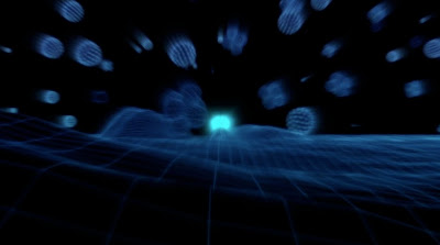
I separate my video into 5 parts:1. Character's body fill up with liquid and then his head opened.2. Some colorful object popped up from his head and the camera zoom into the 'eye'.3. The motions of the brain.4. The grid world(all objects textured with sketch tag).5. Camera zoom out from character's eye.I gave myself one week time for each part, so I could clearly know if I already behind schedule.Since I made the video with sound effector so the scene is exactly accord with the beats, It's easy to compose all the sequence together because the sounds have restrict the time for each part.It's already the end of July after I put all sequences together. My client ask me to hand in the poster before August since the promotion start earlier. She suggested me to design a poster has same style with my video and the title should be conspicuous. I can't pick up a proper frame for poster, so I added some elements which appeared in my video in the poster. At the same time, I start to render the hi- resolution pictures and working on special effects. Reece Morton helped me with special effect and I also adjust the effects in the joints of each section. It's now seems like connect with each other naturally. Reece also helped me modified the audio.
Wednesday, August 17, 2011
Progress- Updated special effects and poster for Masters show
The poster of Brainstorming
Finally I finished the commercial for Duncan of Jordanstone College of Art and Design. Reece Morton helped me with After Effects who also modified the Audio. There is several effects he made.
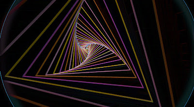
1. Changed the color of the tunnel
 2. Added some particles in 26 seconds.
 4. Change opacity of the close shot
Thursday, August 4, 2011
Dundee Masters Show 2011 - Poster
I made this poster for Masters Show. This is also a part of my project. My client said the style of the poster should accord with the video.However, I can't find a suitable frame for poster. Therefore I decided to make a new one which is basically the same style with my video.
Subscribe to:
Comments (Atom)


